
I admit, cover art is something that draws me to a book. When I receive the Goodreads.com email showing me updates from the people I follow, I glance down the left hand side and see if there are any books that "look" interesting to me.
One thing that I've come to see more of while blogging is the switch of cover art. The most recent book to have a makeover is Lisa McMann's Cyer's Cross.
 |
| Hardcover |
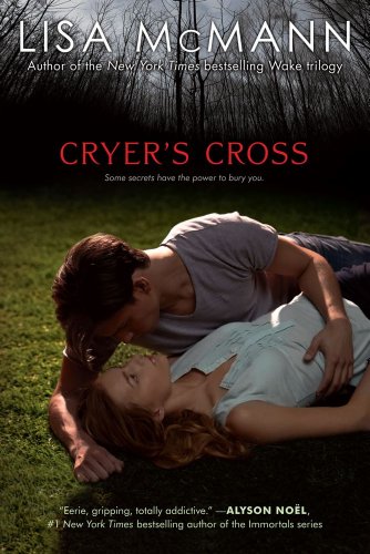 |
| Upcoming Paperback |
I'm not so sure I've ever liked the 'new' versions better though. Or maybe I've just come to love the original and it's like a new baby, you love them both but in different ways? While this cover remake may grab my attention, I feel that this gives off a different expectation. For me, this cover oozes romance. The heart of the story though is creepy, it's a haunting past manifested in a chair and I think the original cover captures that. (Now if this was a vampire story about a guy watching you sleep *also creepy* then I would totally buy into it!)
Cover art can also change partway through the series as well. Here are a couple that I still think about:
 |
| Original Hardcover |
 |
| Updated Cover |
I LOVED the original cover of Wolfsbane, though do think the new cover is a better fit for the story.
 |
| Original Hardcover |
 |
| Updated Cover |
This is actually one of my favorite covers of all time! I can see how it the change worked for well for the entire series, but man was I sad to see this one go.
Then there are the covers which didn't grab me, but the book buzz did and I fell in love with the book.
So what do you think, how important are covers to you? Does the cover art draw you in too? Are there books you would or wouldn't read just based on the cover?
Cover do bring me read a book. I do like the orginal covers of Nightshade but I agree too that the new covers do fit better with the story.
ReplyDeleteI also think that book covers can be so misleading that I think I will like a book and end up disappointed. No I can't think of a book offhand. But there have been times I have been upset with misleading book cover.
The first for Cryers Cross is by far better and more suited to the story.
ReplyDeleteI like both for Nightshade, haven't read them but I kind of love the effect of the wolf.
I LOVE LOVE LOVE Michelle Zink's trilogy and the 3 new covers together, just gorgeous but I also love the orignial, both are winners but I think the new choices are a better crossover to get more readers.
I definitely like the original covers more than the new ones, especially for Cryer's Cross and Prophecy of the Sisters. The creepiness is heightened by the statues (to the point where I can't look at the cover of my copy for too long) and Cryer's Cross looks like any other YA romance now when it's not. :/
ReplyDeleteAngel
Julie ~ They really do create expectations in a story!
ReplyDeleteMarce ~ ohh, now you'll have to read Nightshade ;) I think the second fits better but it also makes the story look a bit too Urban Fantasy at the same time. Gah, I'm hard to please!
Angel ~ hahah yes, those statues really do create a creepiness factor! I think the Cryer's Cross one is way to contemporary looking too :(
ReplyDeleteI really dislike the new Cryer's Cross cover. Doesn't fit the feel of the story at all and talk about cheesy. It looks like a knock-off of the Twilight meadow scene. The original is so awesome and creepy and fit perfectly. :(
ReplyDeleteSame with Nightshade---the original covers really made this series stand out.
I actually love both covers for Michelle Zink's books, too!
Most of the time the orginal cover design is the one I like more and the one I associate with that particular book. Especially with the Nightshade cover, I love the orginal covers. They had the fierce look of the girl on the cover and had a really bright burst of color. I'm a little picky but now that they changed the covers partway through my book covers won't match.
ReplyDeleteLittle Miss Becky ~ that's what I see too LOL! I'm still on the fence about Nightshade because the first cover was so stunning and I love it so much! I like both of Michelle's too, though the original really stuck with me.
ReplyDeleteJenny ~ Yes, the original Nightshade was sooo pretty and that look of her's meant business! I loved that Penguin offered dust covers of the new Nightshade so the owners of the original covers could replace them to fix that matching issue! I however missed out on it :(
ReplyDeleteI think I may have mentioned (several hundred times) to you how much I liked Prophecy's original cover, so I won't say it again :)
ReplyDeleteI totally agree with everyone about Cryer's Cross; I'll never be able to look at one of those desks again. The 2nd cover has nothing to do with the content, though. I actually hadn't seen cover #2 before; totally wouldn't associate it with the book. The first Nightshade is subtle, with the Calla Lilies on the cover. It's just so pretty and does have some relevance. Great post!
Hi Mel, I remember them doing that but I believe it was for US only so I couldn't get a new one.
ReplyDeleteJackie ~ I think that is the scene near the end, so it is story related...but to me, it's only part of the story and not the focus. This cover needs so more creepy factor to it, the woods in the back isn't enough :(
ReplyDeleteNew on all counts in this case :)
ReplyDeleteJenny ~ Yes, I saw it from Penguin US, not sure if Penguin Canada offered them up. Bummer eh!
ReplyDeleteI loooove book covers, they are very important for me and are the main thing that draws my attention to the book. I'm with you on Cryer's Cross I do not like the new cover and even though I haven't read the book yet I heard that it's creepy and that pb cover does not show creepy and it just looks awkward. I was also not a fan of the new Nightshade cover, I loved the original. =)Still loved the book though.
ReplyDeleteI'm guilty for judging books by ther covers... I just can't help myself! It's probably a good thing there are so many pretty covers these day. I'm not really a fan of how publishers will change a cover midway through the series though because then my books don't match...
ReplyDeleteCynthia ~ I agree, CC is not creepy enough and Nightshade's original was sooo pretty! Asm much as I think the new cover fits it better, it also gives off a bigger UF vibe which normally isn't my thing :S
ReplyDeleteLiz ~ Ya, I wonder if they don't realize how picky & matchy-matchy we are :D
ReplyDeleteI like the hardcover of Cryers Cross. I don't like either covers of Nightshade. I like the original cover for Prophecy Sisters. I'm not really into covers with photos of people doing nothing. It's kinda bland unless it really captures the story.
ReplyDeleteBut covers are the first thing I notice and it will often lead me to buy a book aside from a recommendation.
Oh I'm a cover hog. ;D A cover can sell me on a book, one I've not heard anything of and browsing through the bookstore. But I range in my cover loves. I know what I look for in people, but I love the symbols on one too. And I look at backgrounds to see what they can share with us about the story.
ReplyDeleteI like to think covers can tell some of what you are going to come across in the book. Or at least I hope so. :) I'm a cover lover all the way. ;D